Oct. 2nd, 2015


Better, or Worse?
Oct. 2nd, 2015 02:46 pmHouse GOPer threw this graph up on his Twitter:
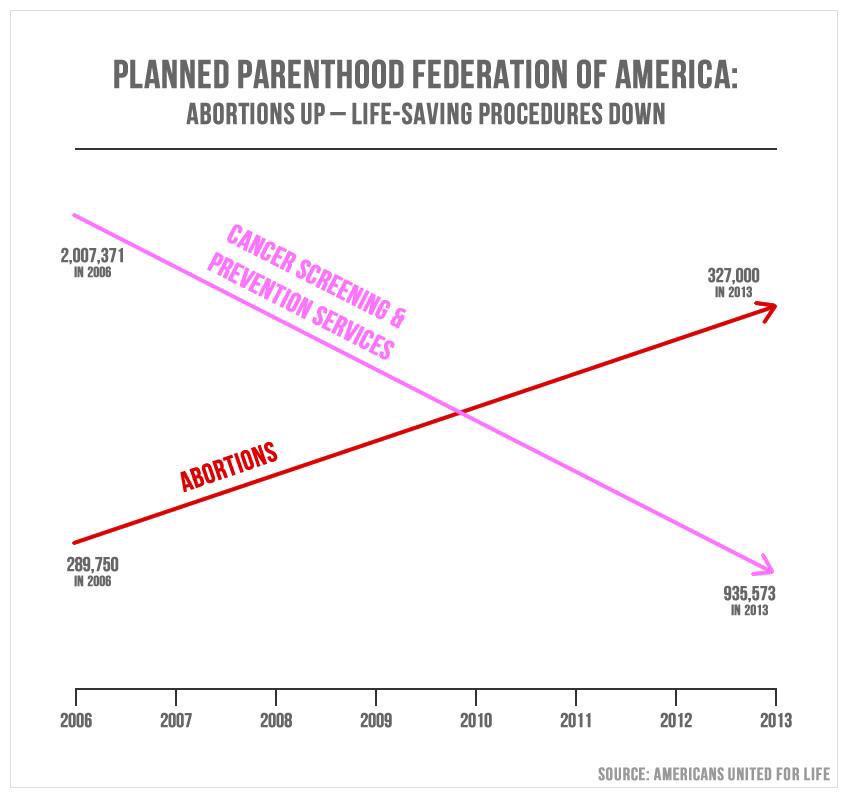
But while the numbers are accurate, the chart is a fucking lie. Let's try again, with facts:
/cdn0.vox-cdn.com/uploads/chorus_asset/file/4108426/abortion-chart-Fpo1.0.jpg)
To get an even bigger picture of it:
/cdn0.vox-cdn.com/uploads/chorus_asset/file/4108478/abortion_chart_2.0.jpg)
But while the numbers are accurate, the chart is a fucking lie. Let's try again, with facts:
To get an even bigger picture of it:


